Why Fancy Text Looks Weird on Social Media
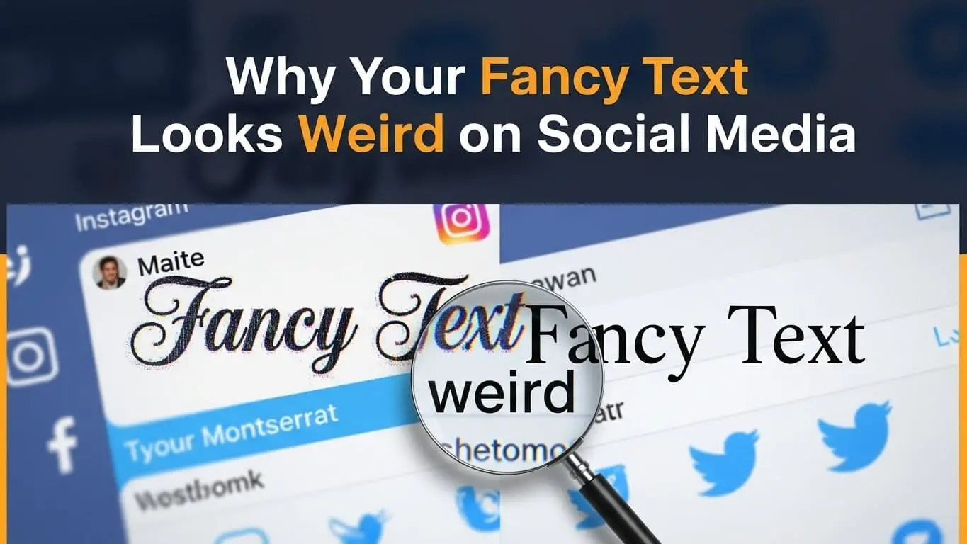
Have you ever copied that perfect fancy text for your Instagram bio, only to paste it and see a bunch of empty boxes or question marks instead? You’re not alone. Why fancy text looks weird on social media is one of the most frustrating mysteries of modern digital life, and it happens to millions of users every day.
Fancy text relies on Unicode characters rather than actual fonts, which is why it can appear differently across platforms and devices. Each social media platform supports Unicode to a different extent, so text that looks fine on one site may appear broken or distorted on another.
Differences between devices and operating systems also play a major role, with iOS, Android, and desktop systems displaying special characters in different ways. Fancy text can also create accessibility issues, as screen readers may struggle to interpret it, potentially limiting your content’s reach. Testing text before posting and using widely supported character sets can help avoid most display problems.
What Is Fancy Text?
When we talk about “fancy text,” we’re referring to those eye-catching, decorative text styles you see scattered across social media profiles and posts. You know the ones 𝐛𝐨𝐥𝐝 𝐬𝐞𝐫𝐢𝐟, 𝑖𝑡𝑎𝑙𝑖𝑐 𝑠𝑐𝑟𝑖𝑝𝑡, 🅂🄼🄰🄻🄻 🄲🄰🄿🅂, and 𝔤𝔬𝔱𝔥𝔦𝔠 𝔰𝔱𝔶𝔩𝔢𝔰 that make your content stand out in a sea of plain text.
But here’s where it gets interesting: these aren’t actually different fonts. They’re Unicode characters—special symbols that were originally designed for mathematical equations, linguistic purposes, and technical documentation. When fancy text generators create these styles, they’re essentially finding Unicode characters that look like stylized versions of regular letters.
Popular fancy text styles include:
- Mathematical bold and italic variations
- Circled and squared characters
- Gothic and script-style letters
- Strikethrough and underlined effects
- Small caps and superscript styles
People commonly use fancy text for Instagram bios, Twitter display names, Facebook posts, TikTok usernames, and anywhere they want their content to grab attention. The appeal is obvious—in a world of identical-looking text, fancy characters make your content pop.
The problem? Not every platform, device, or operating system knows how to handle these special characters properly.
The Technical Reason Why Your Fancy Text Looks Weird on Social Media
Understanding why your fancy text looks weird on social media requires diving into the technical world of character encoding and platform limitations. The answer isn’t as simple as “it’s broken” there are several interconnected factors at play.
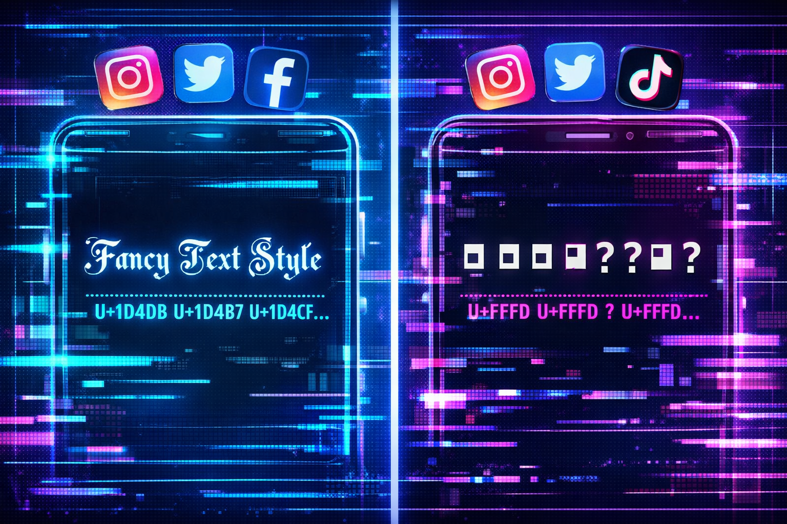
Unicode Character Support
Unicode is essentially a massive library containing over 140,000 characters from virtually every writing system on Earth, plus thousands of symbols, emojis, and mathematical notation. When fancy text generators create stylized text, they’re pulling from specific Unicode blocks like:
- Mathematical Alphanumeric Symbols (U+1D400–U+1D7FF)
- Enclosed Alphanumerics (U+2460–U+24FF)
- Letterlike Symbols (U+2100–U+214F)
- Miscellaneous Symbols (U+2600–U+26FF)
The catch? Not every platform supports every Unicode block. Some social media sites deliberately limit which characters they’ll display to prevent spam or maintain visual consistency. Others simply haven’t updated their systems to support newer Unicode standards.
Platform Limitations
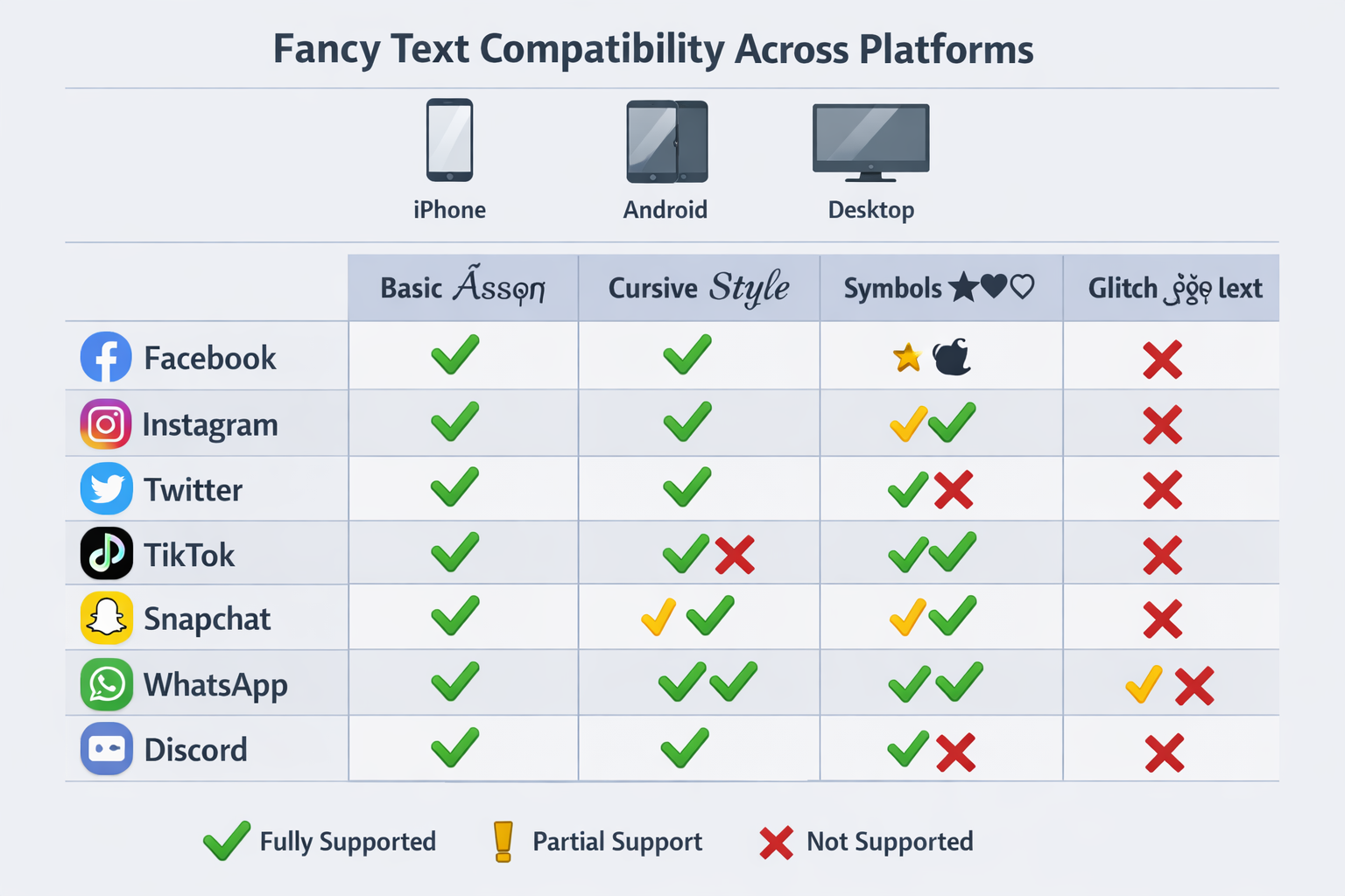
Each social media platform handles Unicode differently, creating a patchwork of compatibility issues:
| Platform | Unicode Support Level | Common Issues |
|---|---|---|
| Moderate | Missing mathematical symbols, bio vs. post differences | |
| Twitter/X | Good | Display name rendering varies by app version |
| Limited | Aggressive filtering, strips many decorative characters | |
| TikTok | Basic | Username restrictions, caption inconsistencies |
| Conservative | Professional focus limits fancy character support |
Instagram tends to support basic fancy text in posts but may strip certain characters from bios. Twitter generally has better Unicode support, but the mobile app sometimes renders characters differently than the web version. Facebook is notoriously restrictive, often filtering out decorative characters entirely to combat spam.
Device and Operating System Differences
Even if a platform supports certain Unicode characters, your device might not display them correctly. This creates the frustrating situation where your fancy text looks perfect on your iPhone but appears as empty boxes on your friend’s Android phone.
iOS generally has excellent Unicode support and regularly updates its character library. Android support varies dramatically depending on the manufacturer and Android version Samsung devices might display characters that completely fail on older LG phones. Desktop browsers usually have the best Unicode support, but even here, differences between Chrome, Firefox, and Safari can cause rendering variations.
The bottom line is this: fancy text exists in a complex ecosystem where platforms, devices, and operating systems all play a role in determining whether your carefully crafted text appears as intended or turns into digital gibberish.
Common Problems with Fancy Text on Social Media
When your fancy text looks weird on social media, it typically manifests in several predictable ways. Recognizing these patterns can help you troubleshoot issues and choose better alternatives.
Missing characters showing as boxes is probably the most common problem. Those empty rectangles or question marks appear when your device simply doesn’t have the font data to display a particular Unicode character. This happens frequently with mathematical symbols and obscure decorative characters that weren’t designed for general text use.
Broken formatting creates another layer of frustration. You might find that your carefully spaced fancy text gets compressed into an unreadable mess, or that line breaks disappear entirely. Some platforms automatically adjust spacing around special characters, destroying the visual effect you were trying to achieve.
Copy-paste failures occur when platforms strip certain characters during the posting process. You’ll paste your fancy text, and it looks perfect in the compose window, but after posting, half the characters have vanished. This is particularly common on Facebook and LinkedIn, which have aggressive content filtering systems.
Accessibility concerns represent a serious but often overlooked problem. Screen readers—the software that visually impaired users rely on to navigate the internet—often can’t interpret fancy Unicode characters properly. Your stylish bio might be completely incomprehensible to users with disabilities, potentially violating accessibility guidelines and limiting your audience reach.
Platform penalties are an emerging concern as social media algorithms become more sophisticated. Some platforms’ spam detection systems flag excessive use of special characters as potentially suspicious content, which could reduce your post visibility or even trigger account restrictions.
How Different Social Media Platforms Handle Fancy Text
Understanding why your fancy text looks weird on social media requires knowing how each major platform approaches Unicode character support. The differences are more dramatic than you might expect.
Instagram offers moderate Unicode support with some quirks. Basic mathematical bold and italic characters usually work well in posts and stories, but Instagram’s bio section is more restrictive. The platform tends to support enclosed characters (like ⓐⓑⓒ) better than script styles. Interestingly, what works in your bio might not work in comments, and vice versa.
Twitter/X generally provides the best fancy text experience among major platforms. The site supports a wide range of Unicode characters and rarely strips them during posting. However, there’s a catch: the mobile app sometimes renders characters differently than the web version, and third-party Twitter clients may have their own limitations.
Facebook takes a conservative approach that borders on hostile toward fancy text. The platform’s spam prevention systems aggressively filter decorative characters, especially in posts that might be promotional. You’ll often find that fancy text works in personal posts but gets stripped from business page content.
TikTok sits somewhere in the middle, with decent support for fancy text in captions but strict limitations for usernames. The platform seems to prioritize readability, so overly decorative characters often get filtered out automatically.
LinkedIn reflects its professional focus with limited fancy text support. While basic mathematical bold might work, script styles and decorative characters often fail. This actually aligns with the platform’s business-oriented culture, where readability trumps visual flair.
Pro tip: Always test your fancy text on the actual platform using the device your audience is most likely to use. What looks perfect on your desktop might be completely broken on mobile.
How to Use Fancy Text Without It Looking Broken
The key to avoiding why your fancy text looks weird on social media situations is strategic planning and smart character selection. Here’s how to use decorative text effectively without the frustration.
Test Before You Post
Never trust that fancy text will work correctly without testing. Create a draft post or use the platform’s preview feature to see exactly how your text will appear. Check your content on multiple devices—if you’re posting from your iPhone, ask a friend with an Android to verify how it looks on their device.
Pay special attention to the difference between desktop and mobile views. Many users primarily consume social media on their phones, so mobile compatibility should be your priority even if the desktop version looks perfect.
Stick to Well-Supported Characters
Some Unicode characters have much better cross-platform support than others. Mathematical bold (𝐥𝐢𝐤𝐞 𝐭𝐡𝐢𝐬) and mathematical italic (𝘭𝘪𝘬𝘦 𝘵𝘩𝘪𝘴) tend to work reliably across most platforms and devices. Small caps (ʟɪᴋᴇ ᴛʜɪꜱ) also have decent support.
Avoid these problematic character types:
- Obscure script styles that look hand-drawn
- Characters with excessive decorative elements
- Symbols from specialized Unicode blocks
- Anything that looks too far removed from standard letters
Use Reliable Fancy Text Generators
Not all fancy text generators are created equal. Some tools use character combinations that are more likely to display correctly, while others prioritize visual appeal over compatibility. Look for generators that offer preview options and warn you about potential compatibility issues.
Avoid sketchy websites that require downloads or ask for social media permissions. Stick to well-established tools that focus on Unicode character conversion rather than font manipulation.
Keep Readability in Mind
The goal of fancy text should be to enhance your message, not obscure it. If your decorative text is difficult to read even when it displays correctly, you’re defeating the purpose. Use fancy text sparingly perhaps for headers, key phrases, or your bio—rather than for entire paragraphs.
Consider your audience and context. Fancy text that works for a personal Instagram account might be inappropriate for professional LinkedIn content. Match your text styling to your brand and platform expectations.
Accessibility and SEO Concerns with Fancy Text
While fancy text can make your content visually appealing, it creates significant challenges for accessibility and search engine optimization that many users don’t consider.
Screen reader problems represent the most serious accessibility concern. When visually impaired users rely on screen reading software to navigate social media, fancy Unicode characters often get read as meaningless strings of letters and numbers, or sometimes not at all. Your stylish “𝒷𝑒𝒶𝓊𝓉𝒾𝒻𝓊𝓁” might be announced as “mathematical script small b, mathematical script small e, mathematical script small a…” making your content completely incomprehensible.
Search engine indexing issues can impact your content’s discoverability. While major search engines have improved their Unicode handling, fancy text can still interfere with keyword recognition and content categorization. If you’re using fancy text for important keywords or hashtags, search algorithms might not properly index that content.
Platform algorithm penalties are becoming more common as social media sites crack down on spam and low-quality content. Excessive use of special characters can trigger automated filters that reduce your post visibility or flag your account for review.
Best practices for inclusive content include using fancy text sparingly and always providing context clues that help all users understand your message. If you use decorative text for emphasis, make sure the meaning is clear even without the visual styling.
Alternatives to Fancy Text for Social Media
When your fancy text looks weird on social media or creates accessibility issues, several effective alternatives can help your content stand out without the technical complications.
Native platform formatting offers the most reliable approach. Instagram’s built-in font options for Stories, LinkedIn’s text formatting tools, and Twitter’s emphasis features provide styling options that work consistently across all devices. These platform-specific tools are designed to integrate seamlessly with each site’s technical infrastructure.
Strategic emoji use can add visual interest without Unicode compatibility issues. Emojis have much better cross-platform support than fancy text characters, and they’re specifically designed for social media communication. Use emojis to break up text, highlight key points, or add personality to your posts.
Image-based text gives you complete creative control. Create graphics with your desired fonts and styling, then post them as images. This approach works particularly well for Instagram Stories, Facebook posts, and LinkedIn articles where visual content performs well.
Platform-specific features often provide better alternatives than fancy text. Use Instagram’s highlight covers, Twitter’s pinned tweets, or LinkedIn’s featured section to make important content stand out without relying on special characters.
FAQs About Fancy Text on Social Media
Why does my fancy text show up as boxes?
Your device doesn’t have the font data needed to display those specific Unicode characters. This commonly happens with mathematical symbols and decorative characters that weren’t designed for general text use.
Is fancy text safe to use on social media?
Fancy text itself isn’t harmful, but excessive use can trigger spam filters and reduce your content’s accessibility. Use it sparingly and always test before posting important content.
Can fancy text get you banned on social media?
While fancy text alone won’t get you banned, platforms may flag accounts that use excessive special characters as potential spam. Stick to moderate use and follow each platform’s community guidelines.
What’s the best fancy text generator?
Look for generators that offer compatibility warnings and preview features. Avoid tools that require downloads or social media permissions. Simple Unicode converters tend to be more reliable than complex font generators.
Does fancy text work on all devices?
No, fancy text display varies significantly between iOS, Android, and desktop devices. Always test your content on multiple devices before posting to important accounts.
How do I fix broken fancy text?
Replace problematic characters with well-supported alternatives like mathematical bold or italic. Consider using emojis or native platform formatting instead of complex Unicode characters.
Conclusion
Understanding why your fancy text looks weird on social media comes down to the complex interaction between Unicode characters, platform limitations, and device compatibility. While fancy text can make your content stand out, the technical challenges often outweigh the visual benefits.
The bottom line is this: successful social media content prioritizes readability and accessibility over visual flair. Instead of relying on potentially problematic fancy text, focus on creating compelling content that communicates effectively across all platforms and devices.
Your next steps: Test any fancy text before posting, stick to well-supported character sets, and consider alternatives like emojis or native platform formatting. Remember that clear, accessible content will always perform better than stylish text that half your audience can’t read properly.